naming, visual identity & graphic design, advertising & social media
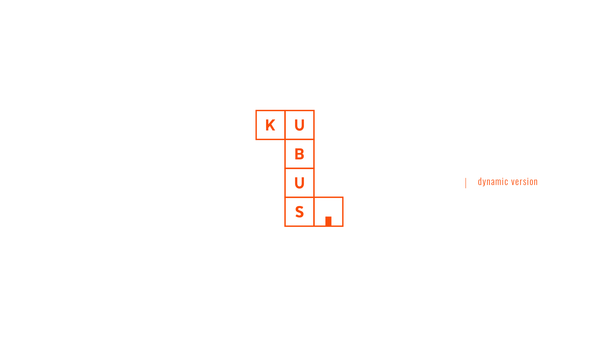
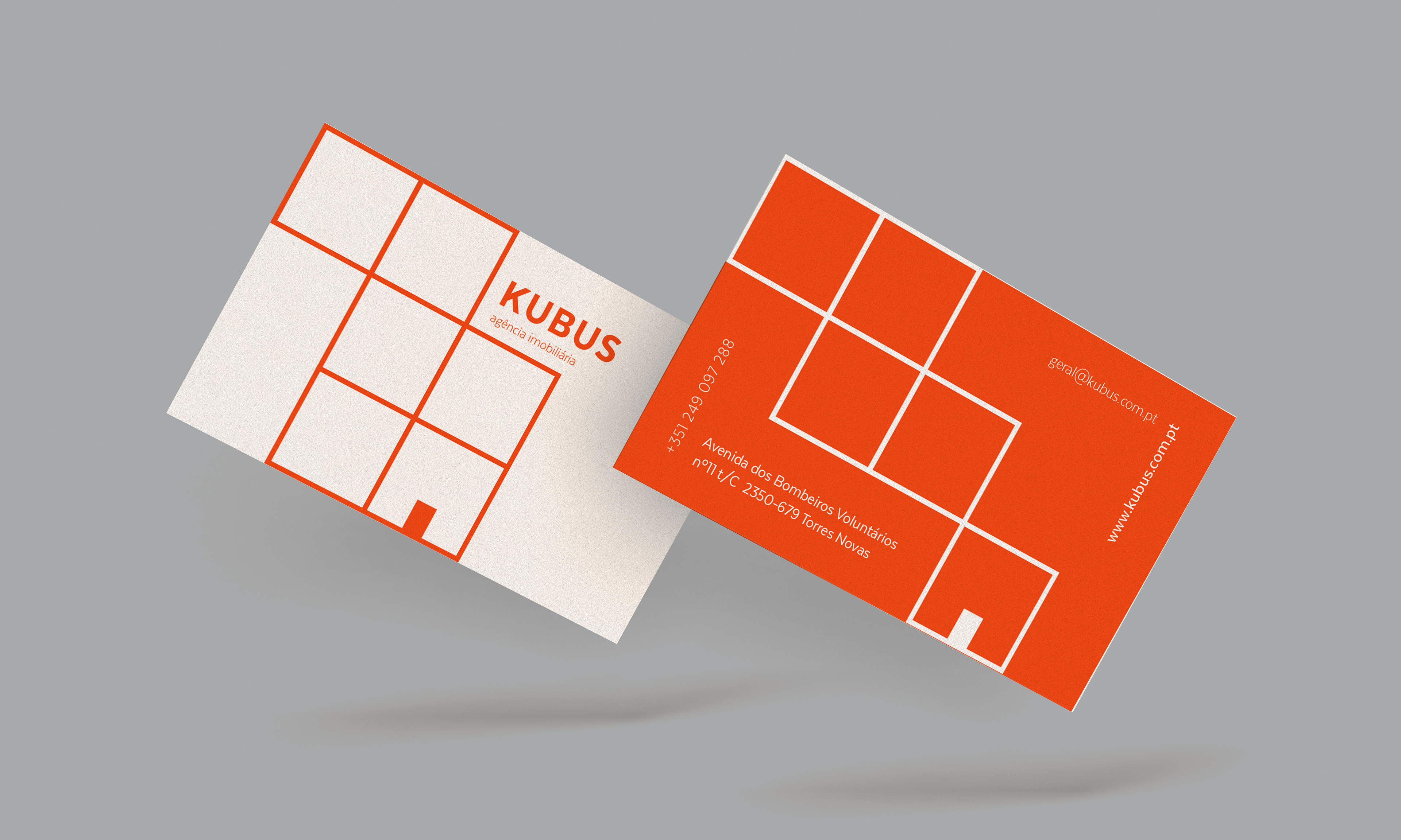
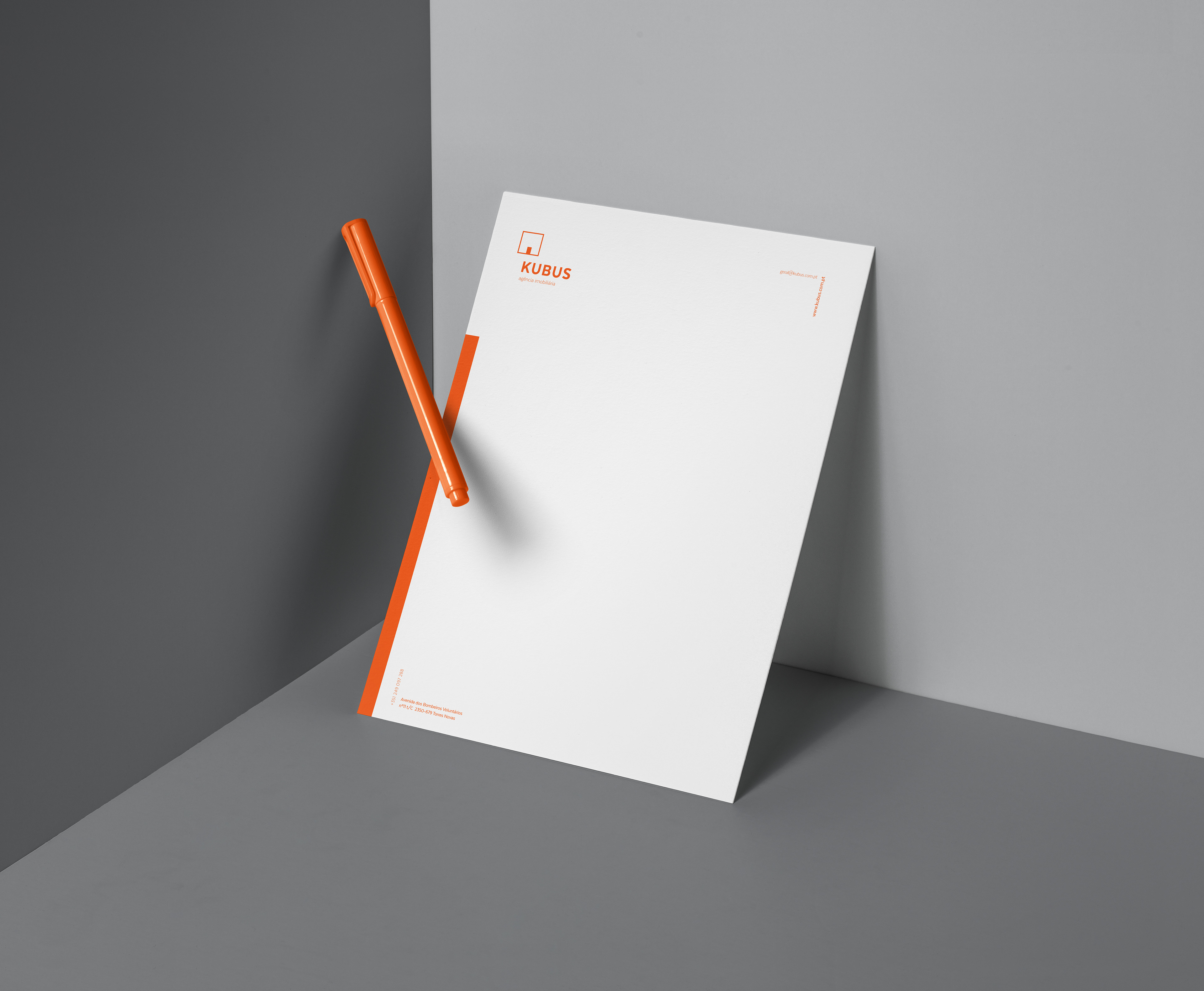
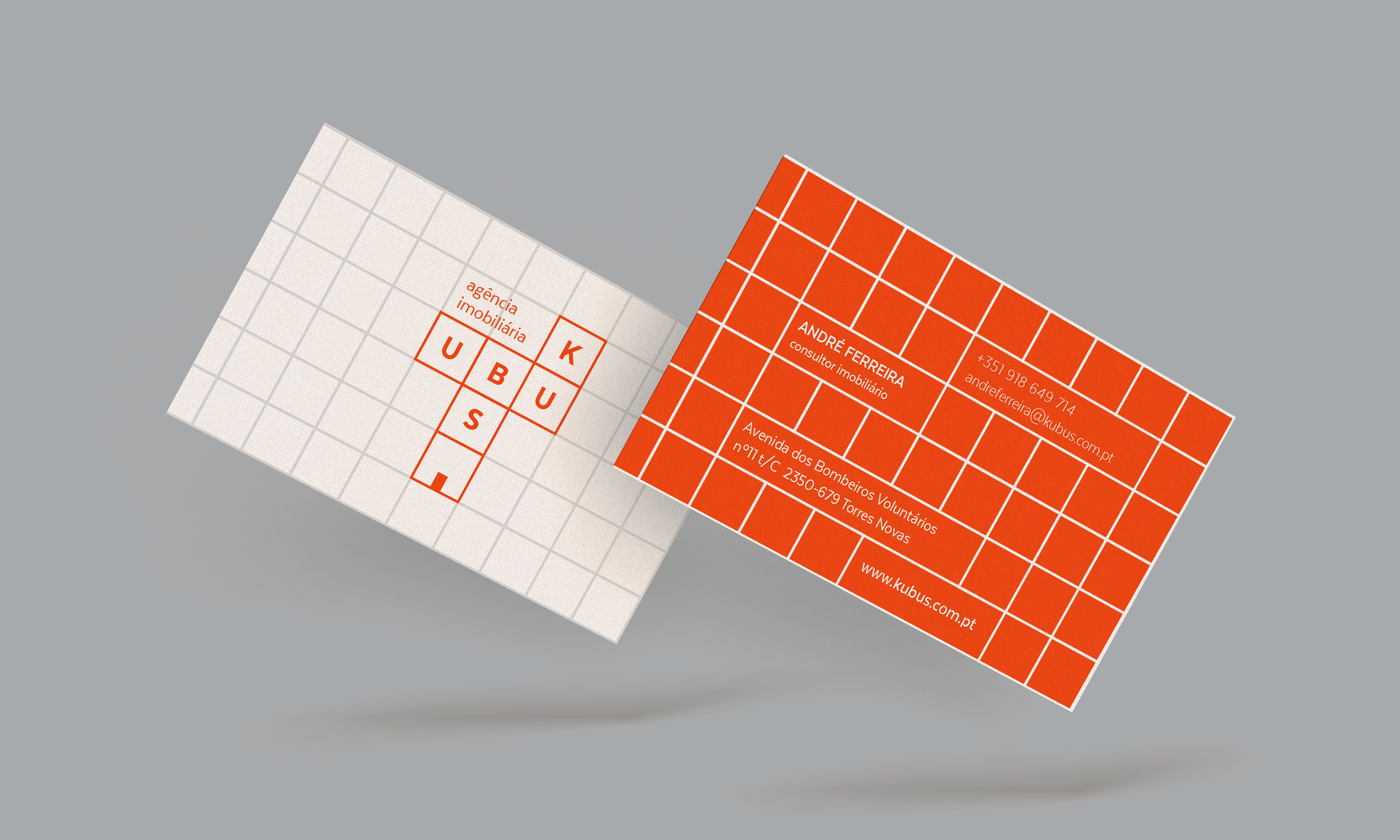
kubus — 2018
print & digital
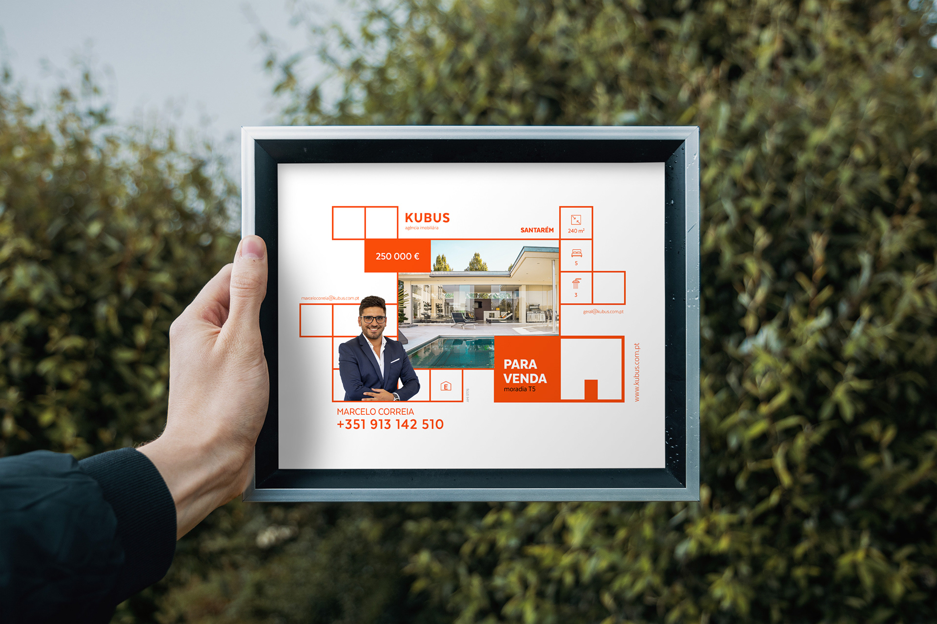
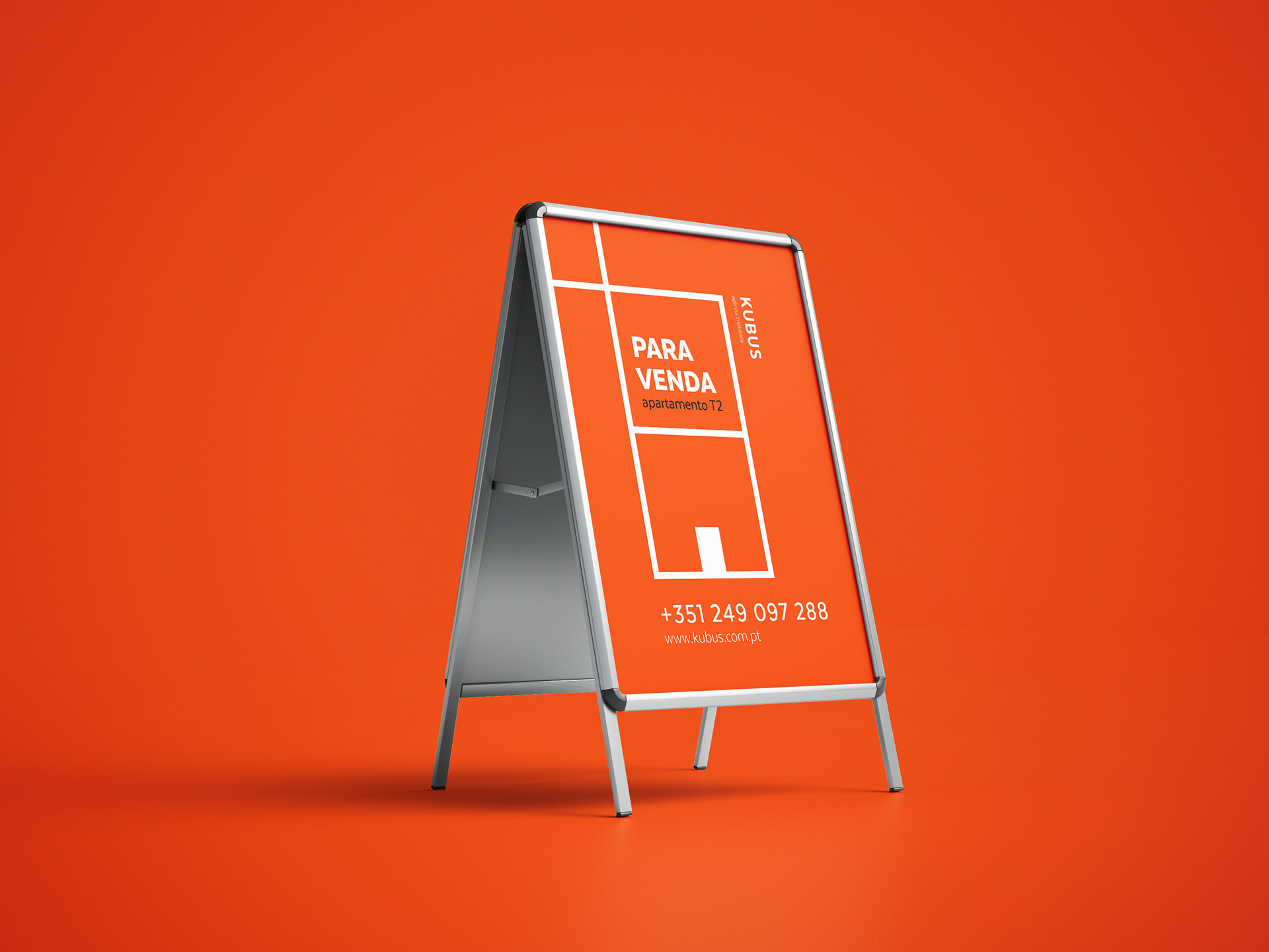
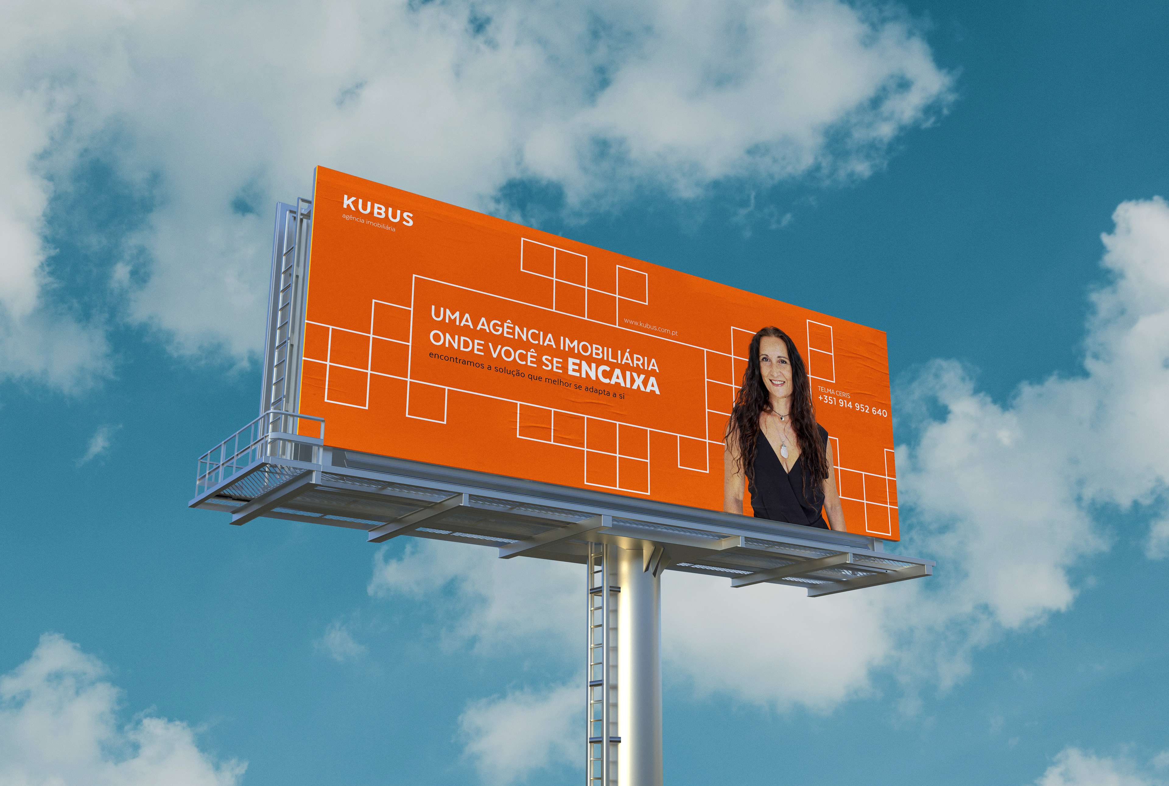
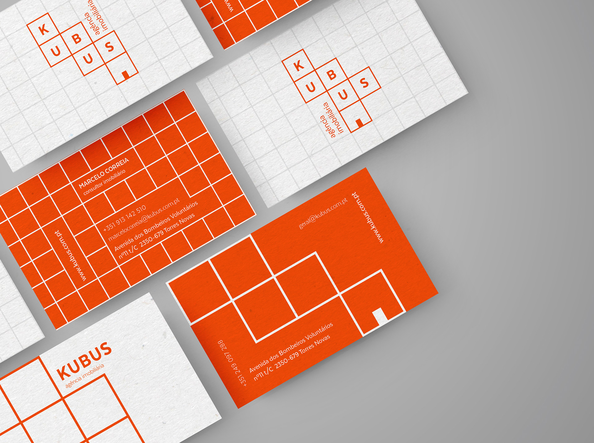
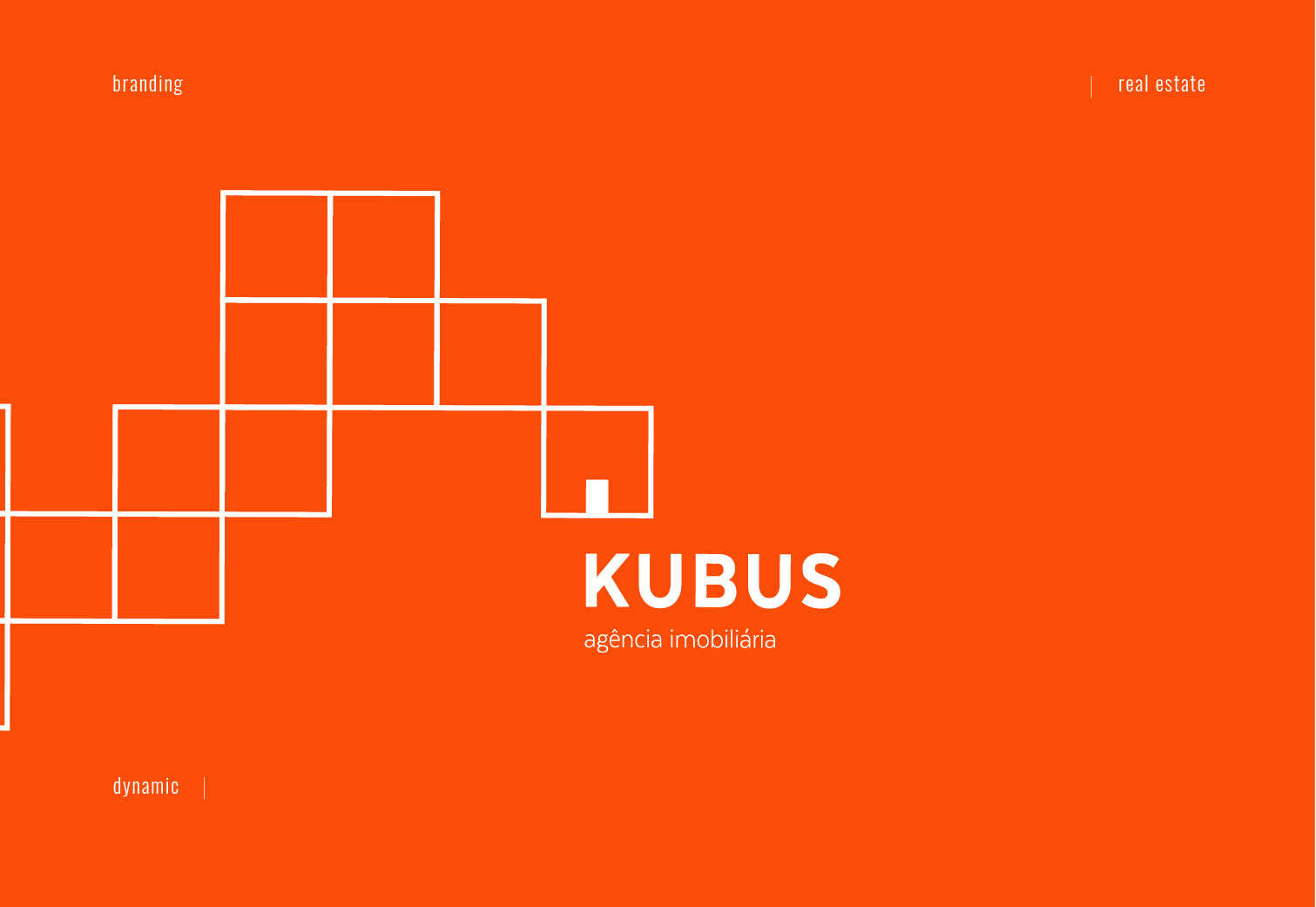
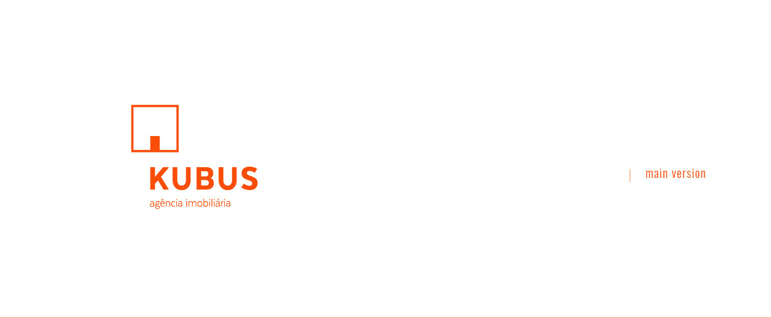
Designed the name and visual identity for a new real estate agency, along with marketing collaterals for both digital and physical mediums.
client Kubus
website www.kubus.com.pt
theme real estate
freelance, Portugal
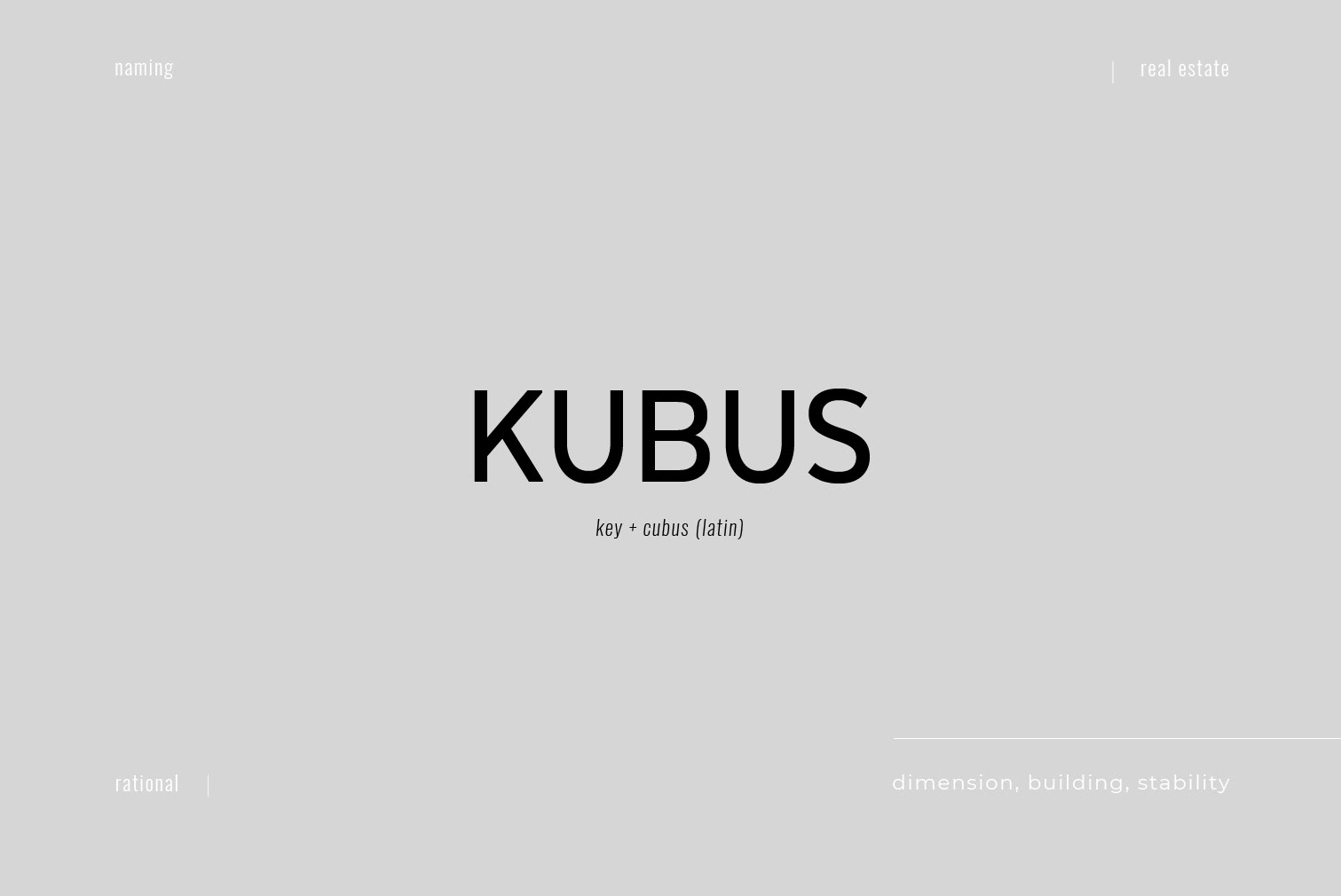
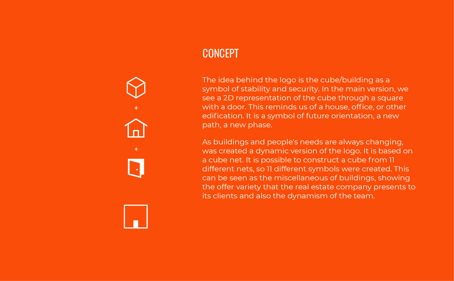
The Latin word ‘cubus’ means cube. Cube is a three-dimensional geometric form with 6 square faces, pointing to the construction and material world. It is formed by straight lines, which gives it stability and security, something we value at home.
In ancient times, the cube symbolized truth, honesty, and transparency. These are some of the company values. In the mystical sense, the cube was also considered to be the symbol of wisdom, moral perfection, and perfect balance.
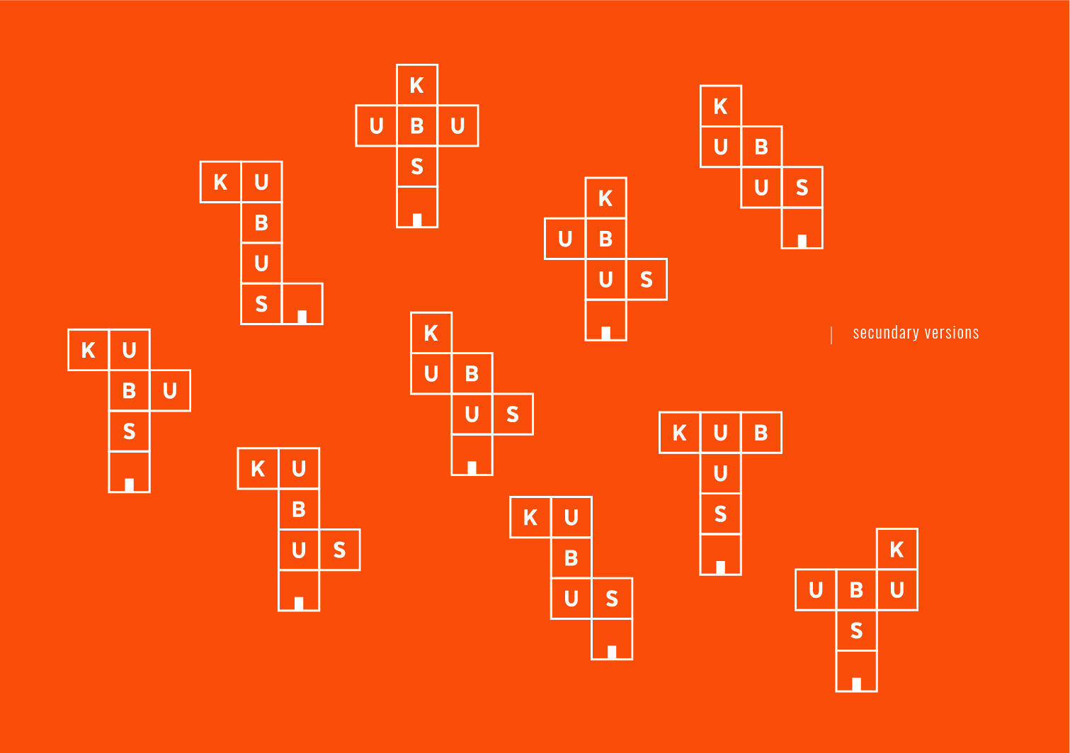
The use of the letter “K” in place of “C”, comes from the word “Key”. The key is a symbol of security, and in a figurative form, it means the one that opens the way. This conveys the idea that real estate agents find the solution for each client and open the way for their dreams/ambitions. In addition, it adds a modern and alternative look.
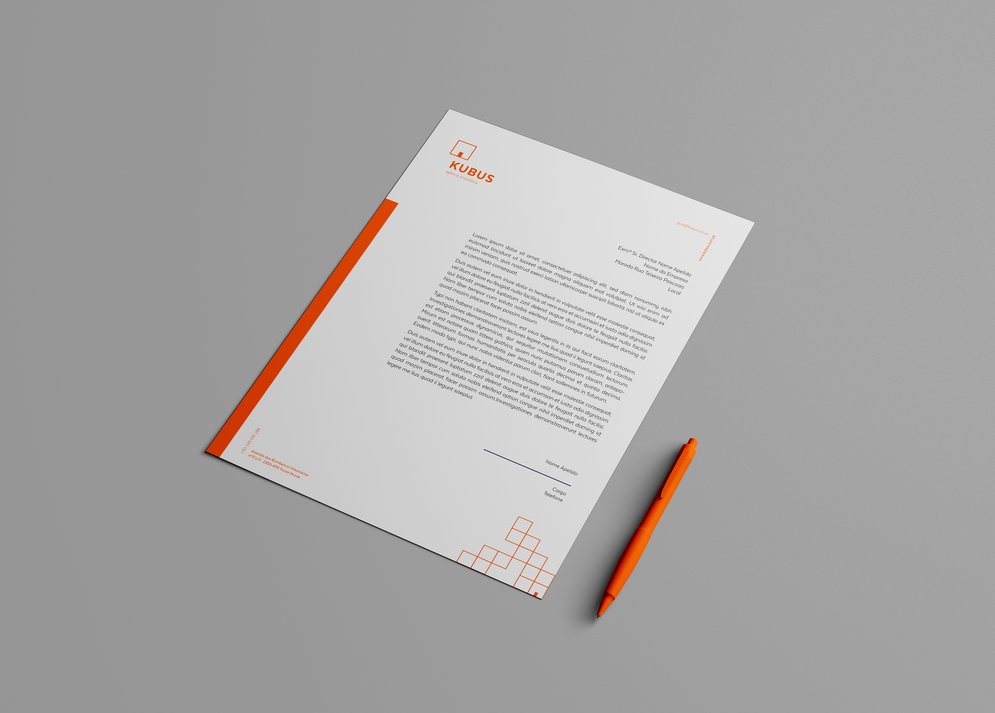
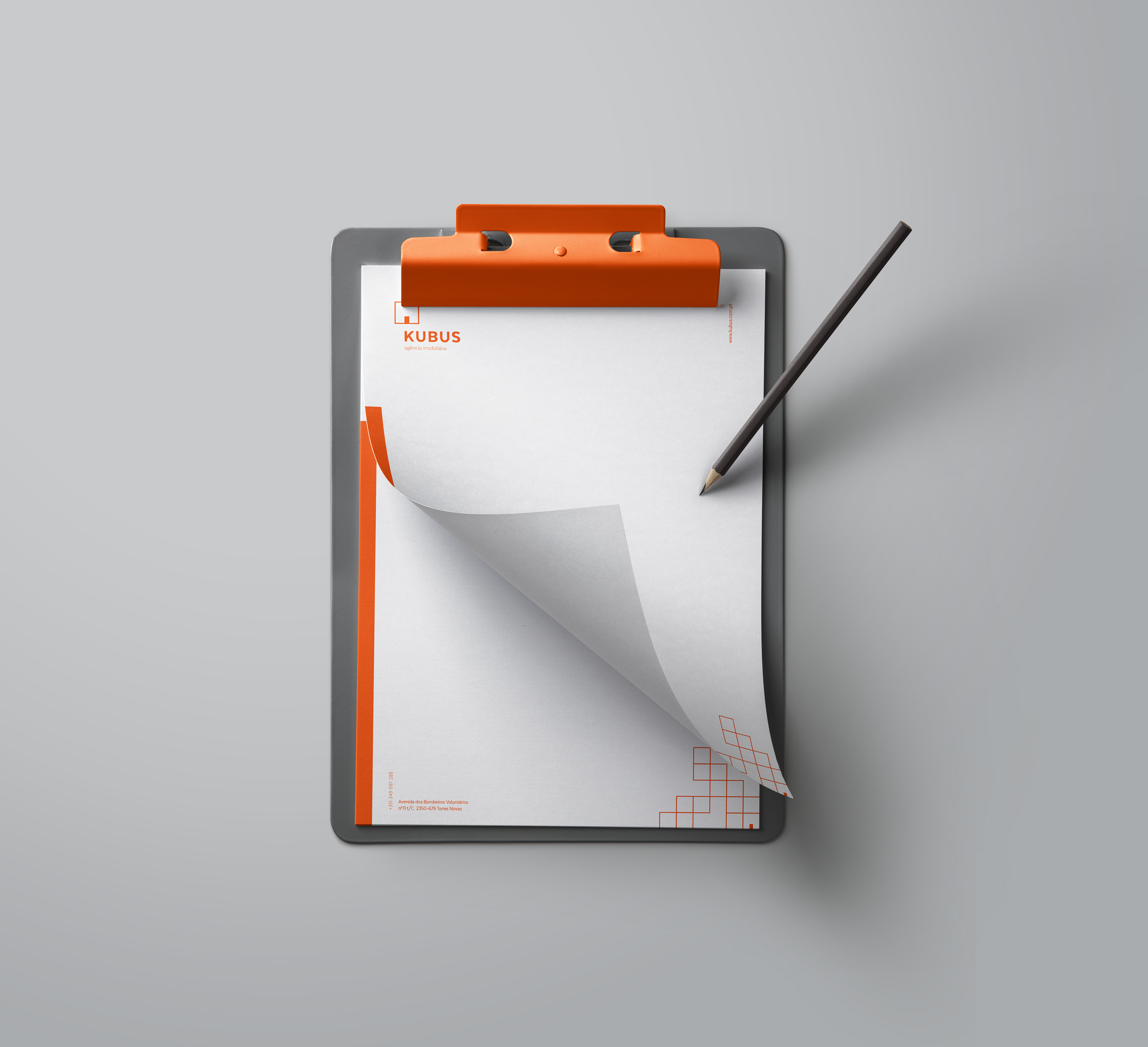
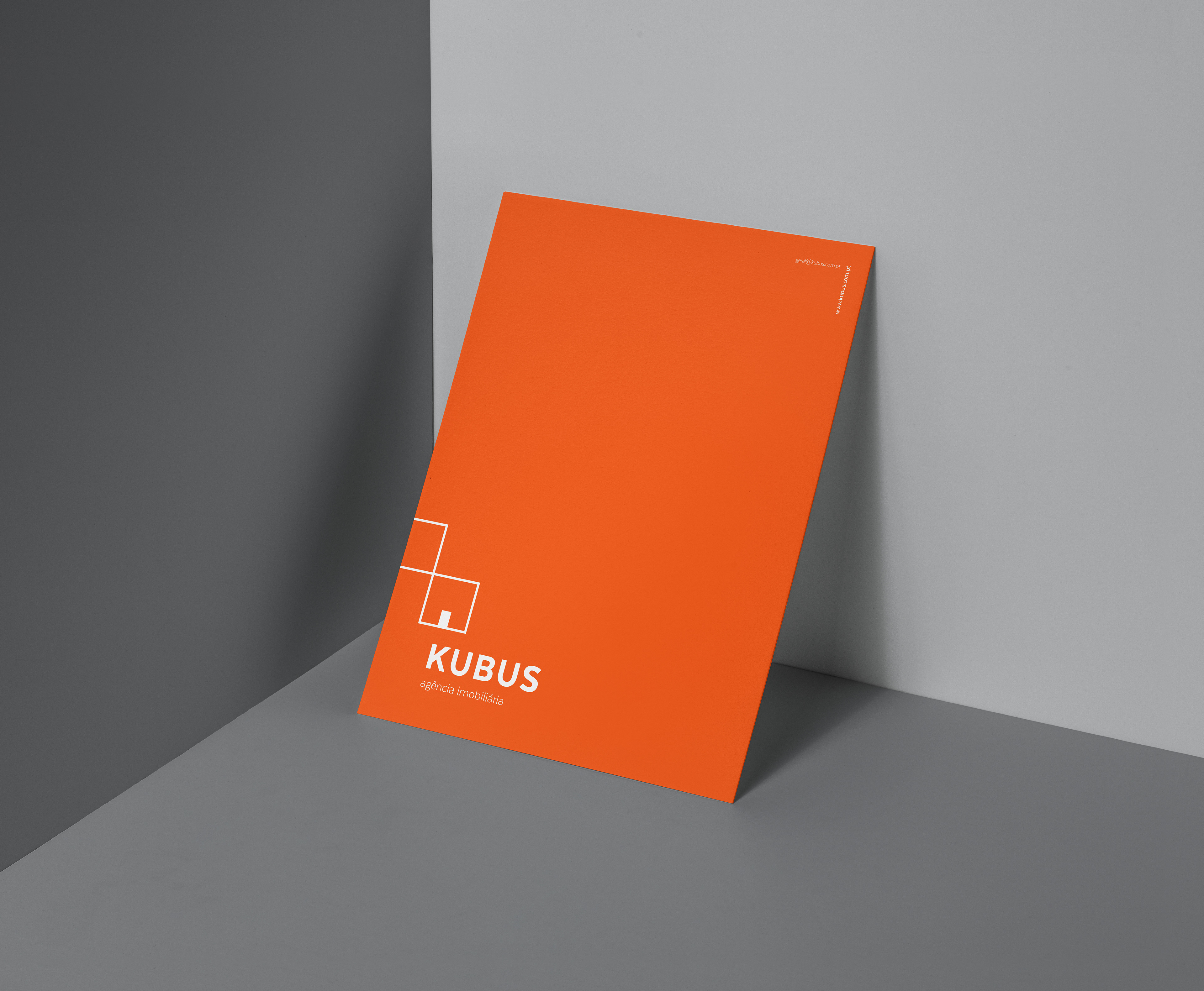
Stationary


Advertising design